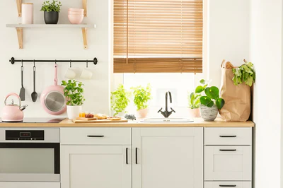
Top 10 Tips For Using Pastels

Decor Advisor
The use of pastels doesn't have to be restricted to quaint cottage themes; they look stunning used in contemporary motifs too. 2# Pretty modern cottage themes:
Belle Chantelle
Pastels still have their place in cottage themes; quaint and dainty or fresh and modern – they'll look fantastic in either. 3# Chose monochromatic:
Elpozo Deagua
Monochromatic pastels look awesome. Just remember to keep the tones within the pastel ranges. 4# Team them with grey:
Pop Sugar
Pastels look stunning against mid and dark tones of grey. 5# Add splashes of bold colour:
Decoist
Add splashed of bolder colours to stop pastels from looking to washed out and insipid. 6# Opt for sorbet shades:
Simone Design Blog
If pastels are too pale for you, use on-trend sorbet colours instead. 7# Rough them up with texture:
Decoist
Bring a modern edge to pastels by roughing them up with texture. 8# Calm bold décor with pastel accessories:
Houzz
Pastels have a natural ability to calm bold decorating schemes without detracting from the essence of the style. 9# 2015 trends – en plein air:
British Ceramic Tile
Go for one of this year's colour trends of 'en plein air' using butter-milk and soft blues. 10# 50 shades of grey: