


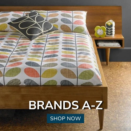


The top ten achievable interior design trends for Autumn / Winter
It’s fine trawing through all the design and trend forecasts season on season to educate and inspire ourselves with what’s hot and what’s not and the who’s who of top designers and recognised stylists; but more often than not many of us (that is the majority of us with realistic homes, realistic incomes and realistic budgets, leaving in the real world!) just want to know how to decorate our homes with current flair and style.
We want a fast track know how of how to translate all the techno jargen and all the predicted trends, styles and colours of the season into our real and more importantly functional homes. ‘Show’ houses are great, but they’re not homes, so I thought I’d summarise some of the most reaslistic and achievable of the style predictions to give you a quick heads up for the season ahead..........
1. Navy Blue
The classic blue and white colour combo was a strong theme for the summer, seeing pale and bright cobalt blues combined with fresh whites for nautical and French Colonial interior styles. And as the season darkens, the blue deepens and it is Navy that will find favour throughtout the autumn and winter months. Still offering a nod towards nautical if you wish, but this time emulating the deeper depths of the ocean,

Navy is a very user friendly and versatile blue and can be effectively adapted to most (if not all) interior styles from classical to ultra modern and minimalistic. It can be used as an alternative neutral to black; in crisp, sharp contrast to white, or will indeed pair well with most other colours in the spectrum from brights and neons to earth tones and pastels. It pairs beautifully with chartreuse, as demonstrated in the Elizabeth Hurley collection above, proving that navy really is an all round interior ‘good-guy’!
Our Richmond printed duvet set shows just how versatile the colour is too, as here, it is showcased against bare brick and natural wood to give a relaxed but stylish studio feel.

And here again, in complete contrast, navy makes a stunning but very stylish statement in the form of these luxurious floor length, faux silk,embroidered curtains in a bright white and ultra modern setting which carries the volume of navy very well. 
If you’re among the colour cautious though when it comes to strong colours like navy, then using it purely as an accent colour and adding a little here and there to punctuate your colour scheme with touches of it in furniture and accessories is equally effective with such a user friendly colour.
2. Geometrics
Geometrics like florals, are seldom, if ever, absent from the seasonal design portfolio. Designs this year have been influenced by everything from industrial evolution to curvy lines and Scottish Tartans. The striking ensemble above puts the emphasis on modernity by drawing together, through a series of cotton prints , an array of bold geometric repeats and naive graphics derived from botanical forms – most noticeably dandelions, tulips and honeycombs.

The lifestyle images and cameo shots demonstrate the clever combination of a number of the season’s other trends too. The industrial look of the brick walls and the neutral base shade of warm grey , plus the selection of carefully chosen rustic and tactile accessories, such as natural wood, woven baskets and fur – all of which could be changed in an instant – which, incidentally, demonstrates the versatility and value of another of the season’s trends, which is chameleon decorating.
3. Tartan Plaids
Tartan plaids with authentic Scottish origins (loosely falling under the geometrics category), are unmistakably prominent in fabrics, furnishings and wall coverings for autumn/winter 2014/15 ..... and are featuring in slightly toned down hues of the vivacious red and black combinations noticeable on the catwalks. For interiors, these vivacious reds and daring blacks are combined with grey, beige and taupe hues to turn down the heat a notch or two and make them into workable designs for interior schemes – perfectly fitting for the rustic/country trend emerging for the season. The lifestyle image above shows how well the country look and warm rustic colours can work even in a modern and bright white setting, to add style and character to the room. I love the white stag’s head to give an authentic but modern twist on the country/hunting feel! The fabric in the image is aptly named ‘Balmoral’ and is just one of many adorable, stylish and on-trend tartan plaids available from Terry’s this autumn/winter season.


Even our ready-made ranges cater for this stylish trend, making it easy and affordable to achieve the season’s top looks, no matter what your budget. Our ‘Isla’ curtains are fully lined and the simple eyelet heading creates elegant columns in the soft drape fabric which shows the large plaid design off to best effect. The cool grey tones the design a very contemporary feel and would accommodate any number of accent or accessory colours too. Tartan doesn’t have to be reserved just for living areas either. It looks very effective, even stunning, in the bedroom too! This ‘Seattle’ design from our American Freshman range uses just a touch of tartan trim as a border around this plain charcoal grey duvet set, giving it style and interest. The roomset again uses just enough of the right accessories to give it a country/hunting style feel whilst keeping it modern and current. A complementary mix of natural and neutral colours and materials complete the look perfectly.


Plaids and stripes are working particularly well together this season in mixed and muted shades of beige, grey and taupe, as the Seattle image demonstrates. This set, far from using subtle trims, goes full on tartan, making use of an oversized check as the body of the duvet set, with a contrasting stripe as the border. The look is simple but clean and the country feel has been played down in favour of a studio/apartment style feel. However, the cool grey still works well against the warm colours of the wood floor, the bare brickwork and the wicker hamper.
And here again a large plaid applies some apartment therapy to a very simplistic room set by adding both pattern and interest with the simple addition of our ‘York’ duvet set. The cool grey colour way keeps the room subtle and stylish, but the room set looks equally effective with an energetic injection of red!
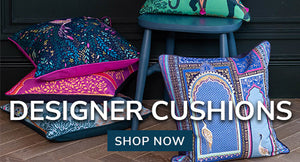
But if being bold and making a statement isn’t for you in either the colour or the pattern stakes and you prefer subtle but still stylish, then what about our ‘Courcheval’ collection? This subtle tartan check in muted naturals has the look of a quality tweed – the kind you would expect to see a high-class country gent sporting as a hunting jacket. The collection includes matching curtains, cushions and a throw, making this relaxed country style ensemble easily achievable and a charming and detailed embroidery of a stag’s head within a crest on the cushions, gives the set a true air of nobility, stylish quality and class.


Muted browns, beiges and naturals are great shades to mix together for an authentic country-gent, tweed style interior. And whilst reds, blacks, browns and greys may be the front runners in the tartan charts this year, other popular colours are putting in an appearance too. If you’re a fan of the turquoise to duck-egg part of the colour spectrum like me, then our ‘Verbier Teal’ collection could be right up your street (or down a country lane even!?) when it comes to injecting colour style and interest into your autumn interiors. Dark grey is mixed with vibrant teal to create the same tweed style plaid but with a refreshingly modern colour twist. Duck-egg and teal shades work great with browns and greys for a modern take on a traditional design.


And here’s another modern take on the teal theme - ‘Ryan’ takes the oversized plaid to a new level with this modern, fresh and crisp looking teal, navy and beige combo. The bold design gives impact to the minimalistic room setting and apart from the few carefully placed ornaments, needs little or no dressing-up to achieve an effective and eye catching interior.
4. Animal Themes and Macro Prints
Spring/summer 2014 gave us a profusion of bird and butterfly prints, owl motifs and various other bird and animal images both accurate and stylised. The autumn sees ethnic and animal prints and many of these animal themes remaining, but redircting slightly with a more rustic nod, which incoroporates wildflowers, landscapes, trees, wildlife and countryside animals such as horses, dogs, ducks, squirrels and farm animals, harvest produce and fruit. Motifs are more detailed, realistic and mature than previous stylised designs though and true to life macro (photographic) prints are also becoming evident in interiors on fabrics, furnishings and wallcoverings.

‘Sweet Butterflies’ is a perfect print for summer into autumn decor. The butterfly theme was undoubtedly popular throughout the summer months, but this delightful design makes it perfect for a transition into the autumn as the colour way combines the vibrant and cheerful turquoise blues so prevalent throughout the summer, with spicey autumn shades such as orange, terracotta and red. The turquoise accents in the lifestle image above keep the look bright and cheerful as we ease into the duller days of the year. Note too the inclusion of the tactile rug, in-keeping with the resurgence this season of the use of ancient and familiar materials and patterns such as fur, bamboo, metal and woollens, all updated in elegantly provocative ways.

‘Farmyard Animals’ as the name suggests is a pictorial themed fabric depicting animals typically associated with the farm yard, but in a more mature way than some of the stylised images of the previous season. The colour combination is light and fresh on a subtle striped background which perfectly showcases the beautifully detailed animals. Themed prints like this have often been considered as childish and have often been reserved for children’s rooms or twee little kitchen themes; but the lifestyle image of a country living room above, undoubtedly demonstrates that themed prints have come of age, now earning their place as stylish and credible additions to our interiors.

Similarly our ‘Hounds’ design shows detail, style and maturity but is given a fun and playful (rather than immature) slant.........

...........when creatively combined with spots, stripes or checks.
Even ‘Autumn Fruits’ have been given a stylish and mature makeover in the lean towards authentic country style and charm this season. This cotton print, which combines image and script in a modern take on a food print, beautifully combines seasonal colour in the form of versatile greens and warm autumn reds, with a light background; again bringing a bright and fresh approach to autumnal decor. The design is again mature enough to be versatile and adaptable and great for accessorizing without being too twee. And what country fabrics collection would be complete without chickens?? ‘Hens’ has a natural linen coloured base across which artistic, watercolour, painterly-style hens and cockerels are illustrated in a warm but versatile colour palette.
This design brings the farmhouse kitchen look bang up to date without losing any of the nostalgia and home charm associated with solid oak tables, muddy boots and the smell of fresh bread! Again combining a themed print like this with crisp stripes and checks keeps the look fun, fresh and current; and keeps any element of ‘twee-ness’ to a minimum! Macro prints – i.e. photo realistic images - are playing their part in our interiors this season and are presenting mainly as landscape, cityscape, countryside and wildlife themes, like the poppy meadow one above, these fun and quirky cityscape voiles and this horse themed duvet set.
5. Chameleon Decorating
We are consistently encouraged by design fashionistas these days to express our personalities through our homes and interiors, to stretch our imagination, showcase our characters and demonstrate our uniqueness by unleashing our ‘inner creativity’! We are also encouraged to follow what’s (dare I say?) on-trend! This is great if you’re on an endless budget...... but, most have us have to work within the limitations of our financial restrictions (or at least a realistic budget in a world where we need to be increasingly thrifty and freugal.....), so chameleon decorating is a great way to achieve a seasonal look and express personal style at the same time, without major outlay!
Basically this means establishing a neutral base colour scheme and then adding ‘style’ or a ‘theme’ with accent colours, accessories and key colour pieces which, while looking like a well thought out and integrted part of your interior scheme, are all easily changed or removed, without major outlay. Hence ‘Chameleon’ – changing your colours to suit your surroundingsn or fit in with a particular theme. The ususal way to achieve this is to use wall-art, cushions, rugs, curtains, blinds and ornaments to add the key (or accent) colours and to change only these pieces (and not the base colours), to achieve a completely different look or trend. Good base cololurs are white, black & white combo, grey, beige, linen or any earthy or stone shades.

The lifestyle image above is a perfect example of ‘Chameleon’ decorating and is bang on-trend with the neutral ‘greige’ base tones! The walls the floor and the other major items in the room that you wouldn’t normally consider changing with any reugularity – such as the fireplace and the sofa - are all in varying but harmonious shades of the grey/beige palette. The only injection of additional colour, style or theme is added by means of the accessories.
The cushions and fabric throw, add a nod towards a country style theme with the charming duck print fabric, ticking stripe and check prints. The carefully placed fauna on the side table cleverly picks out the yellow and gold tones in the fabric and the duckegg colour on the chimney breast picks out the teal-ish blue shades on the heads of the mallard ducks. The whole ensemble looks very stylish, well thought out and fully co-ordinated and yet the whole style and theme of the room could be changed almost instantly by simply replacing the cushions and the throw! Picture it if you can with a bold red floral, a chartreuse green geometric or maybe deep aubergine, black or rich turquoise accents???? The possibilities are endless with such a neutral base palette!
These two examples further demonstrate the flexibility and versatility of chameleon decorating, but this time in bedroom settings. In both scenarios a completely neutral base scheme provides a blank canvas on which to create a colour scheme. The first image sticks to the neutral palette with the deep grey duvet and only hints of colour are added in the cushions and surrounding accesories. In the second a burst of colour is added by the multi-coloured duvet set, from which any number of colours could be picked out to accessorize with.
6. Naturals
Naturals, naturals, naturals! This season, in everything from flooring to walls and from fabric choice to the tiniest detail in a lamp or accessory and even to the colours and construction of products in the home, everything is leaning heavily towards 3 families of natural and neutral base colours on which to base your interior décor - black, white and sand!
=Elizabeth Hurley Venetto Flint (right) Kylie Eloise Stone - Bottom (left) Kylie Siena Monochrome (right) Kylie Isla Slate")
You can keep to one palette with subtle statements as shown in the four examples above, ....

.......or, you can build off any of these base neutrals and add accent colours to create dramatic impact, as illustrated in this stunning ‘Azar’ bedroom set from Elizabeth Hurley. Gold and bronze accents lift and warm this black and white ensemble, but the same scheme could easily carry off colour accents such as colour of the year – Radiant Orchid, lime green accents or even pops of bright red.

Popular accent colours for 2014/2015 to add to these palettes are Neon Neutrals, Muted Primary Colours and Soft Pastels, but in fairness you could create drama and impact with any number of accent colour combinations with such accommodating and versatile base colours as black, white and sand.
7. Bright & White
Light, bright and white interiors are a massive trend for the 2014/15 Autumn/Winter season, particularly for, but not retricted to, kitchens. White is an expansive colour and can make any space appear larger, so it is particlarly suitable for small kitchens where a good light source is essential. Colour and more importantly seasonal warmth is added to these light bright schemes with accents and accessories like ceramics, glass, pendant lighting, accessories, natural wood finishes, window treatments, bedding, or simply a colourful bunch of fresh flowers; making this trend fit perfectly with the naturals, naturals, naturals trend and with the Chameleon decorating approach too!8. Warm Metallics
Warm metallics are gaining popularity again in interior decor and gold, brass, bronze and copper shades are starting to replace chrome and stainless steels, adding warmth and sophistication in the form of mirror frames, sculptures, trays, lighting fixtures, side and console tables, pieces of occasional furniture and even in fabric and soft furnishing finishes and wallcoverings. These stunning drapes are the latest addition to our Kylie Minogue duvet covers and look almost like liquid bronze! Note the use of the copper hints in the pendant light and side table too, creating a warming and varied mix of metallics.
And in this gorgeous set from the same collection deeper tones of bronze are mixed with luxuriius brown fur and a metallic copper and bronze toned snakeskin style print to create a heavenly and absorbing bedroom. The copper/bronze finish on the side and dressing table pick out the metallic snakeskin borders perfectly!
If you’re not brave enough to be all out bold and metallic then simply adding some metallic accents such as sumptuous scatter cushions, lamps or ornaments can provide just the touch needed to bring your look up to date; and the six I’ve picked out above have all bases covered when it comes to the up and coming metallic shades for the season.
Finally, while we’re talking metallics, it’s worth mentioning that these two stunning brass tables also show a quirky little trend that is emerging for using two identical coffee tables side by side. Not only does this work aesthetically to fill a large space, but provides the functional option of separating them and moving them around to accomodate different social or entertainment needs....might actually give this one a try???? Aesthetic and practical has to be a winning combination! Makes me think of the words of the designer Wiliam Morris... “Do not have anything in your home that you do not know to be useful, or believe to be beautiful”
9. Reflective surfaces
Reflective surfaces, most noticeably Lucite (perspex) and glass, are making a return with avengeance to our interiors. Transparent furniture and furnishings such as tables, stools, lamps, vases and candlesticks are excellent design tools as their reflective and ‘sparkling’ qualities create the illusiion of additional light and space, acting almost as an additinal light source and thus adding to an open and expansive look as well as creating interesting refections.
Reflective finishes such as glass beads and sequins added to fabrics, fixtures and accessories also contribute to this reflective revolution and ultra smooth and reflective finishes on luxurious fabrics play their part too. In the lifestyle image above for example, a multitude of reflective surfaces create a stunningly opulent but open and expansive feel to this bedroom even though the colour scheme is a neutral and subdued one. The curtains are luxuriously reflective, there is a mirrored glass table bythe bed, the fur insets and throw on the bed have an almost pearl like lustre, the pendant lights are beautifuly clear and reflective and even the fabric that the headboard has been upholstered in has a luxurious silky sheen.
These stunning drapes are also beautifully reflective in their own right, but the polished metal lamp and the reflection of the drapes n the side of the mirrored glass furniture again, only serve tio amplify the reflective qualities of the room, creating expansive and illuminating casts of light on the walls and floor.
10. Statement pieces
Statement pieces are being used to create drama, add a touch of whimsical fun or just some personality to our interiors. These are pieces that create a talking point and trigger dinner party conversations and the options are endless. It could be an unusually shaped or oversized chair,a sculpture, an unusual light fixture, a unique piece of wall art, a peculiarly odd table or cabinet, a large area rug , or even just a statement cushion or two! - it doesn't matter, whatever suits the scheme or reflects character and personality!Sources
| Robin Lechner Interior Designs Josh & Main Pinterest PinterestPinterest | LOVEAMV Ralph Marks Knock Off DecorPinterest | Ralph Marks Ralph Marks bingPinterest |


