


Interior colour trends for 2017

Interior Colour Trends for 2017
We’re going to be seeing lots of blue and green, several yellow tones from pastel to perky primrose, some mature reds, a fiery red, a dash of greyish purple, a taupe toned neutral or two and copious amounts of multi-tonal whites to name but a few.
Many of the big names in colours and interiors are harmoniously singing off the same hymn sheet, producing their own unique colour collections but with common colour trend predictions evident within some of those collections.
Predictions come from some of the biggest and most reliable names in colour and interiors, such as - Dulux’s colour of the year, Pantone’s top ten, Farrow & Ball’s favourite four, Valspar’s delicious dozen and offerings from the likes of Benjamin Moore and Sherwin Williams too - and of course some affordable product thrown in where appropriate to help you to get the look (or colour) you’re after in 2017 and to transform your home for less....
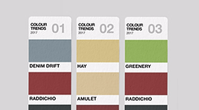
Denim Drift - Dulux Colour of the Year
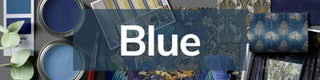
Pantone have three blues in their colour palette for 2017 – a turquoise blue, greyish blue and a bright blue. Dulux too have embraced blue as a key colour trend for 2017 and have a range of elegant and classic tonal blues.

However, they have put the weight of their knowledge and experience behind one delicious and versatile shade in particular which they have hailed as their colour of the year this year - ‘Denim Drift’.
The versatility of this beautiful, timeless and soothing grey-blue, draws two parallels with the well known, everyday, wardrobe staple from which it gets its name; and they are - ‘simplicity’ - and - ‘goes with everything’! And again reflective of the things we wear, Dulux describe it as the ‘perfect fit’ for the times we live in as it reflects that real desire for simplicity in an otherwise crazy and hectic world. Denim Drift is definitely a ‘one-size-fits-all’ kind of colour, fitting into all interior styles.
F&B’s Studio Green and Benjamin Moore’s Knoxville Gray
‘Studio Green’, which F&B hail as a refreshing if not defiant alternative to the ubiquitous charcoal darks, is an intensely deep, dark, black-ish, heritage green, …. “ unapologetically clubby”... with a … “fantastically timeless old world quality”.

This shade is opulent and mysterious and yet would not look out of place in any modern setting today. On a similar vein, Benjamin Moore’s Knoxille Gray is a grayish-green (or greenish-gray, whichever way to prefer to look at it) and therefore has more of a gray undertone than Studio Green but has the same rich, deep, intensity and opulence, maintaining its equal versatility as a neutral dark. Gray hasn’t had its day as a base neutral by any means, instead these new grey and black toned green darks create strikingly different, if not nostalgic or masculinely romantic base neutrals which work incredibly well against black or white, but which could happily offset any number of other lighter, brighter accent tones from pastels right through to citrus brights.

F&B Hay & Benjamin Moore’s Amulet
‘Hay’, as its name suggests, is a pale, quiet straw colour and one of a number of trending tones originating from the yellow side of the colour spectrum this season. Not a bright or typically sunny yellow though, like Pantone’s Primrose prediction, but one that is...” aged, with a slight undertone of green and a subtle depth.
Benjamin Moore’s Amulet, although slightly deeper in shade is still a soft, warm and welcoming colour that evokes a light and airy ambience, but in a marginally brighter, slightly more intense and therefore more cheerful hue, more typically associated with sunshine and brighter days. Both are versatile shades as they work well in rooms with either good or poor light sources and from the ‘colour-psychology’ angle they are refreshingly rejuvenating, yet reassuring, peaceful and calming.
All White and Chalk White from Farrow & Ball, and Benjamin Moore
White, white, white layered with more white, has been a look trending for interiors for a while now, so F&B’s ‘All White’ should be well received. A pure white, devoid of colour and with no pigment as F&B describe it, but not a brilliant white; ‘All White’ “creates an uncomplicated feel which is naturally fresh but not stark”.

F&B say that the key is to create a mood of stillness and calm by layering whites and only whites, together and suggest combining it with other whites from their product range such as Great White, Cabbage White and Strong White. They then suggest that these collective whites would make a great and uncomplicated backdrop for showcasing art or natural materials (as illustrated in their lifestyle shot at the top). Chalk White from Benjamin Moore draws the relevant colour parallel here and the ‘Let There Be Whites’ page of their website gives the same accurate and professional style and colour advice when it comes to whites.

Farrow & Ball’s Radicchio and Benjamin Moore’s Dinner Party
Pale, pastel pinks were predominant throughout a good part of 2016 but this year we will see a progression towards stronger reds and all the spirit, vitality and confidence that red brings.
All too often, however, homeowners are sadly reluctant to decorate with red for fear of getting it wrong; fear of suffering from colour overload with what is unquestionably a bold and daring statement colour.Red is synonymously assosciated with danger and as a result too many people see red as dangerous when it comes to decorating. I would implore you to overcome your fear and join the red revolution, particularly with such delicious reds on offer as F&B’s ‘Radicchio’ and Benjamin Moore’s ‘Dinner Party.’ Radicchio “takes its name from the distinctive colour of Italian chicory and, slightly tempered with magenta undertones, has a bright and modern feel to it.”
Benjamin Moore’s Colour of the Year ‘Shadow’
Not really a colour that is prevalent in anybody else’s palettes or predictions this year, Sherwin Williams have made a brave but super stylish and super inspirational prediction with this stunning tone!

You could say that it draws parallels with Farrow & Ball’s Studio Green and Benjamin Moore’s Knoxville Gray, in as much as it is a black-toned dark. The only other colour I have seen drawing similar parallels to ‘Shadow’ is PPG’s Violet Verbena – an all together chalkier, pastel tone of grey-purple, but never the less from the same pack if you like?Purple passion was prevalent several seasons ago when the colour palette didn’t seem to carry anything but purple, but not this kind of purple! This is a unique purple infused with depth and mystery by its dark, smoky undertones, making it yet another new, mature, sophisticated and opulent base-neutral dark. (Word is though that purple in the form of cool violet tones rather than warm pinkish purples are making a come-back and are set to be trending right the way into 2018!)
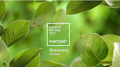
Pantone Colour of the Year - ‘Greenery’
However, it’s not all blues and deep tonal shades. Fresh colours of spring are also apparent and relevant for 2017. At the end of 2016, the kings of colour and revered trend predictors – Pantone, announced their colour of the year for 2017 as 'Greenery'.
Heralded as a refreshing and revitalizing shade, Greenery is a zesty, yellow-green, evocative of flourishing foliage and the first days of spring; and is therefore symbolic of new beginnings. The shade also brings elements of the outdoors in, reconnects us with nature, satisfies our growing desire to rejuvenate & revitalize: and provides us with the reassurance we yearn for in today's turbulent environment.
Greenery is a strong, saturated, powerful green that is vibrant and bright. As with any new colour trend, there will be those who embrace it whole heartedly and will have no hesitation in rushing out to buy gallons of paint to start splashing all over their walls; and those who will take a little more convincing that such a striking and dominant colour has a place anywhere in their homes, even if it’s putting in just the minute-est of appearances!
Pantone’s Island Paradise and Sherwin Williams’s Freshwater
As an avid lover of all things duck-egg, turquoise and teal I just had to pick out these two colours from the palette predictions; not only because they are personal favourites, but because they are colours which translate so easily into decor, home furnishings and interiors.

And whether you’re a lover of the deeper teal shades or paler aqua hues it matters not, as all these tones have a blue/green base which imbues colours of the deepest oceans and of palest skies, evocative of tropical settings, tranquil waters and our desire to chill-ax and unwind. Shades inspired by nature are seldom wrong in tone or quantity when it comes to home decor and tones of turquoise are definitely no exception to that rule.

Pantone’s Primrose Yellow and Benjamin Moore’s Sun Porch
Hot on the heels of ‘Greenery’, in as much as it is another zingy and cheerful citrus shade and from the same side of the colour spectrum, Primrose is another vibrant and energetic colour tipped by both Pantone and Benjamin Moore, with their vibrant ‘Sun Porch’ yellow, to be trending for Spring/Summer 2017 too.
The colour of sunshine itself, yellow is a colour which brings a cheerful warmth and brightness to interior decor. Pantone describe their ‘Primrose Yellow’ as being “full of enthusiasm and joyful vitality, inviting instant warmth and taking us to a destination marked by enthusiasm”; and to the same degree the lifestyle image above shows how Benjamin Moore’s ‘Sun Porch’ can leave a room looking like it’s drenched in sunshine regardless of the weather or season.
Benjamin Moore’s Guacamole and Pantone’s Kale
Tipped by Pantone to be one of the hottest colours for the fashion industry and catwalks this year, Kale draws similar parallels with Benjamin Moore’s Guacamole and is yet another colour that translates into our interior palettes with stylish opulence and ease.

Much like Pantone’s colour of the year ‘Greenery’ these are foliage based green hues, evocative of the great outdoors and yet again reflective of our desires to reconnect with nature and live healthier, greener, lifestyles. Taking their base tones from the vegetable and avacado fruit greens of their namesakes however, these much deeper, subdued and more opulent non-blue greens are lush and fertile natural greens and again have darker undertones of black or brown.

Sherwin Williams Colour of the Year ‘Poised Taupe’
Taupe was trending as an interior colour towards the latter part of last year and has been embraced this year by Sherwin Williams, who don’t normally go for a stand-alone colour of the year prediction.
This year however, the full weight of their knowledge and experience in the colour industry is backing ‘Poised Taupe’, because they have noticed a key trend shift emerging from the trade shows, which sees interior colour trends moving away from the omnipresent grey neutrals of the past few seasons and more towards warmer shades of taupe. particular.Poised Taupe is not a reddish or sandy taupe though, nor is it cold grey-ish beige. It is more of a perfectly equal balance of grey and brown, creating a very versatile and accommodating shade which Sherwin Williams describe as “a timeless neutral which is modern, classic and a beautiful balance of warm and cool.”


