


Colour trends

Spring into summer interiors 2014 will be very colourful. There will in fact be a colour explosion inspired in part by Latin American fabrics and colour combinations.
As usual the palette is diverse and accommodating. Some influences predicting yellow hues from lemon to gold, some fighting the red corner others backing earthy stone and grey palettes.


The colour explosion that is prominent on the catwalks this season, is evidence of how interior design follows fashion, as we can expect to see some bright surprises in store for 2014 with the use of almost neon shades in the home.
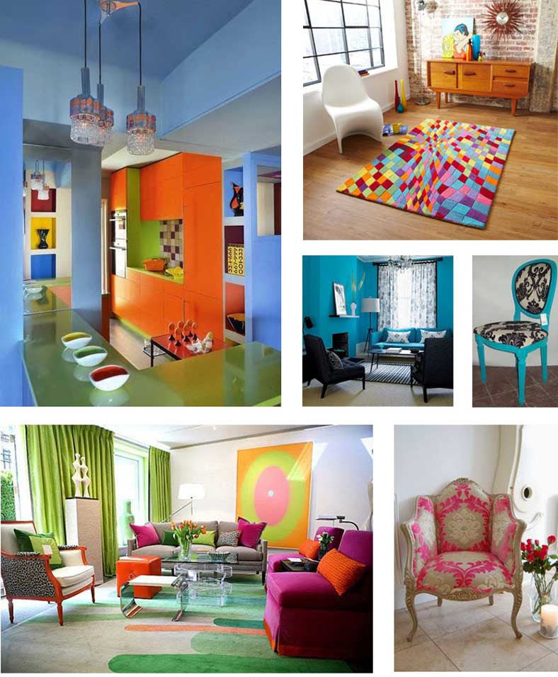
Splashes of bright colour are evident in walls, flooring, fabrics and even in furniture finishes with fuchsia and turquoise again playing a big part – some even predicting that they are becoming the new blacks! Purple

But, what goes around comes around in the fashion and interiors world and in view of the fact that nobody has achieved the impossible yet and actually ‘invented any new colours!’ we will see some old faithfuls back for another season but with altered hues and freshened tints. Purple and pink are set to be the leading colours of the season. Soft lilac, lavender and pink shades will create warm and cosy environments and vivid pinks and deeper purple pinks will provide perfect bold accents.

Not surprisingly, Pantone have already jumped on the band wagon and confidently stated that their colour of the year for 2014 is ‘Radiant Orchid’ – a glowing, warm, pinkish, purple created by the fusion of deep lavender and mauve undertones. And in fairness to their confident prediction, this is a colour that is truly versatile. Feminine but not too girly, masculine enough to use as an accent colour with black, grey or taupe; and vibrant and cheerful enough to be uplifting for the spring and summer head.

Expect to see it putting in appearance in most rooms in the home from office to bedroom and kitchen to bathroom, in everything from furniture to accessories, wall colours, rugs and soft furnishings. As a main colour theme or simply as an accent colour, it will complement blacks or beiges or sit in cheerful juxtaposition opposite yellow-gold or green. Indeed in their press release about the new colour, Pantone advised:
"Spruce up interior spaces by incorporating this eye-catching hue in paint, accent pieces and accessories. As adaptable as it is beautiful, Radiant Orchid complements olive and deeper hunter greens, and offers a gorgeous combination when paired with turquoise, teal and even light yellows. Likewise, the vibrant colour is sure to liven up neutrals including gray, beige and taupe. Uplifting and bold without being overpowering, Radiant Orchid reenergizes almost any colour palette and provides a unifying element for diverse spaces"
... only time will tell if their confident predictions will be realised. It’s certainly a far more digestible colour for interiors than the overpowering Emerald of last year, that’s for sure!

A good test for any interior colour is how wearable it is and Radiant Orchid is a flattering shade for both men and women as it highlights the skin tone., so here’s the proof of its wear ability from this year’s catwalks! Reds

Red will be featuring prominently in interiors but will be appreciated in darker tones and deep mature shades, again influenced by the purple palette to create rich plums and damson shades. Combining it with lighter shades like butterscotch, taupe or mid blues will see it realise its full potential.

And the season’s trend for mixing bright colours and mis-matching patterns, colours and texture, will see red used with purples and turquoises to create vibrant & lively interior combinations. Blues & Whites
 |
 |
 |
 |
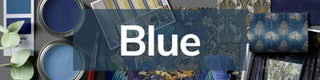
Another winning combination this year will be blue and white. Bright cobalt blue and royal blue will have an undeniable prominence this season, second only in popularity to pinks & purples, but the blue and white combination will be particularly prominent too.

Blue and white together is a classic combination and a sure fire way to make any home appear freshened, expansive and more cheerful. Blue and white florals combined with regency or ticking stripes, will give a nod towards the vintage revival emerging this season, whereas pale blues and white with give a fresh coastal or French colonial look.
Teals & Beige
 |
 |
Other popular colours for 2014 will be Teal Blue and Khaki. Teal is a versatile blue/green which can be mixed with virtually every colour, shade and hue you can think of; and will perform equally well as either a main colour or a subtle accent. Khaki will make a great dominant base colour to offer a refreshing twist on the autumn’s deep taupe and ‘greize’ shades; but for the spring and summer seasons at least, will need to be mixed with brighter hues to give it a cheerful lift or used purely for accessorising.
Sources


